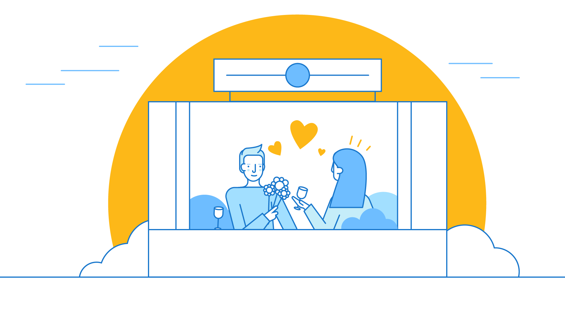
Today we are not going to speak about explainer videos and their necessity for brand-building, we just want to show you our favorite styleframes created during 2018-2019. Are you interested? I hope so because we have great stuff to share.
First of all, let’s define what the word “styleframe” means. Styleframes are colorful pictures made in different styles for visualization of the main scenes of the video. Usually, we create 3-4 styleframes to give the opportunity to choose the most suitable option. Sometimes, we get reference pictures that greatly simplifies our task. But more often after reading Creative Brief, we have a full picture understanding needs and preferences of the client we’re going to work with. It should be mentioned, that with many years of working experience, now it’s easier for us to find the best option that can immediately satisfy our client.
Styleframes will also help your client check if there is a common understanding between his/her and designer’s ideas or he needs to speak to a designer again to explain his own vision. So, as you see, this stage of video production is no less important than all the others. Of course, everyone wants to get a perfect final version of the project he/she pays for. That’s why we have a lot of stages during the process to make sure that we choose the right direction.
#1
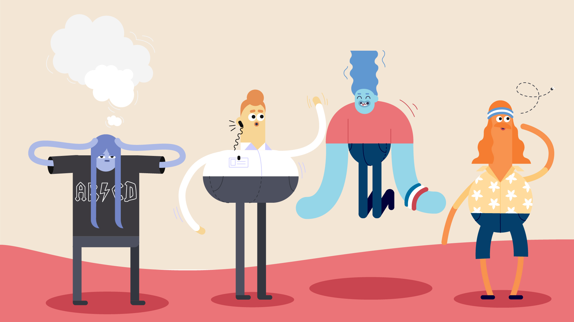
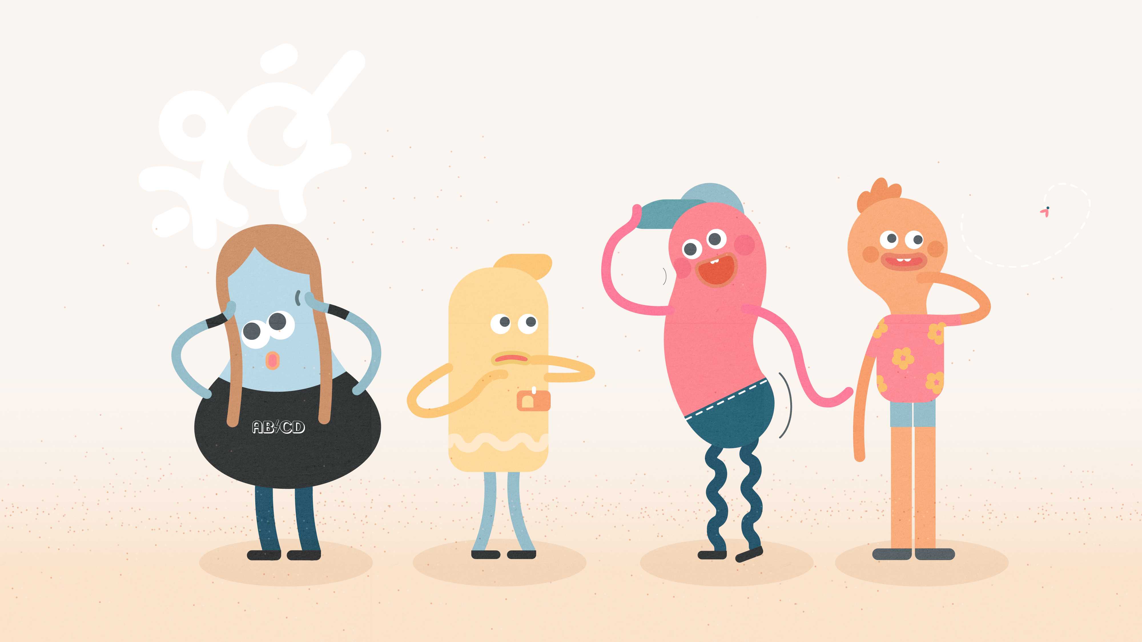
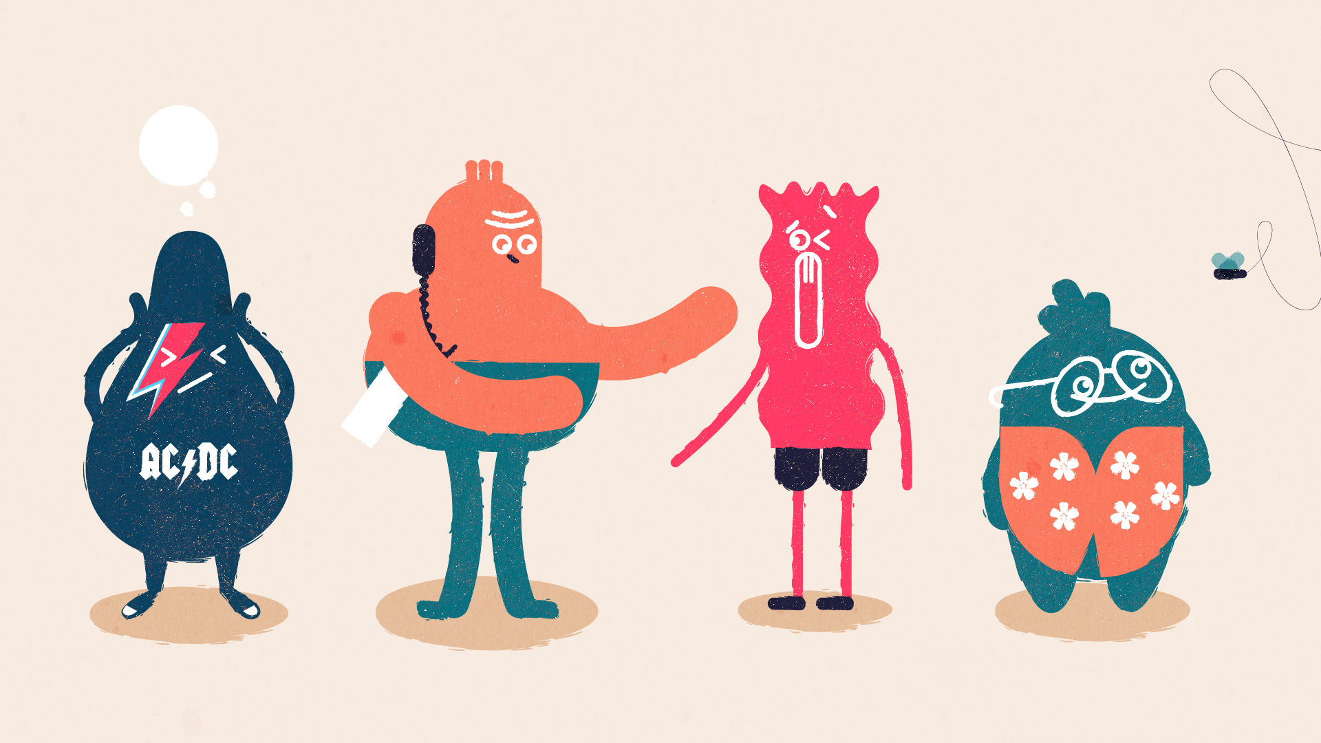
Have you ever heard about Cluttering? Cluttering prevents a fluent flow of words and causes blockages in speech. We created these styles for the video the purpose of which is to tell the world about such problem as Cluttering. We wanted to explain how important for people who have a cluttering speech receive the right help.
#2
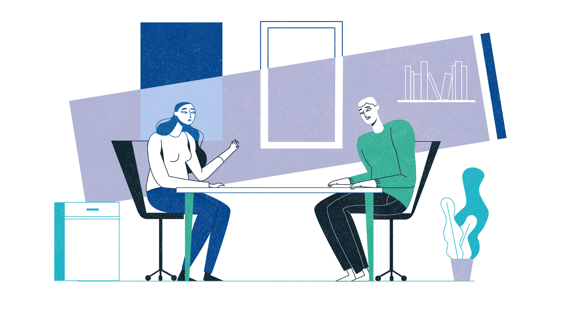
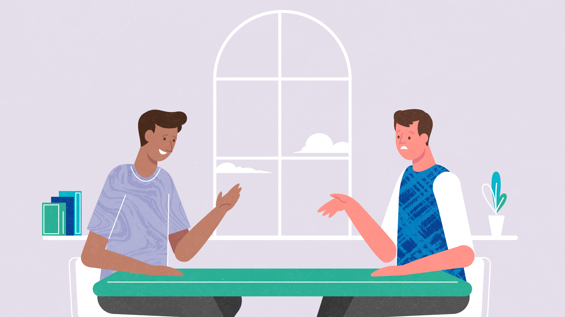
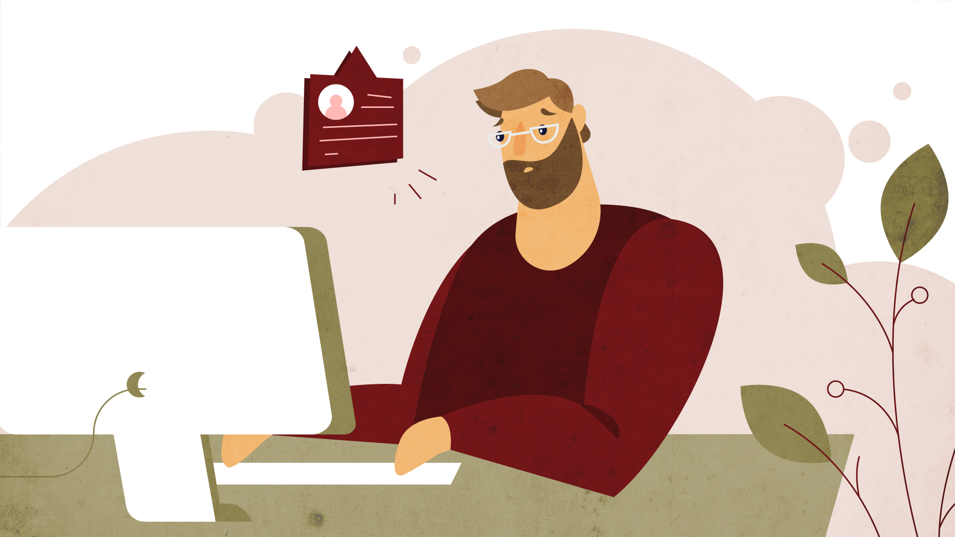
Do you have any financial issues, but don’t know who to ask for help? Stip helps to get your financial problems away. We created these styleframes for the main scene where a tired main character is in a conversation with the social worker, he tells about the financial experts who can help him to take all troubles away.
#3
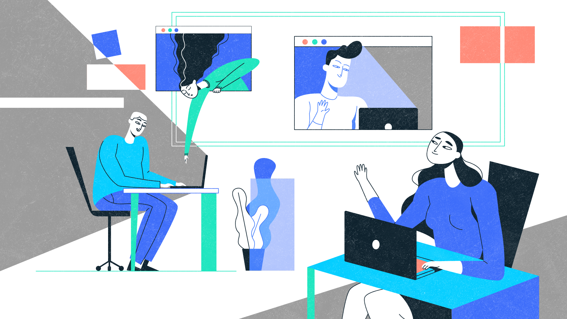
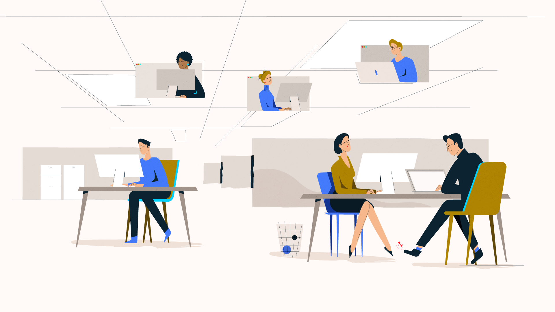
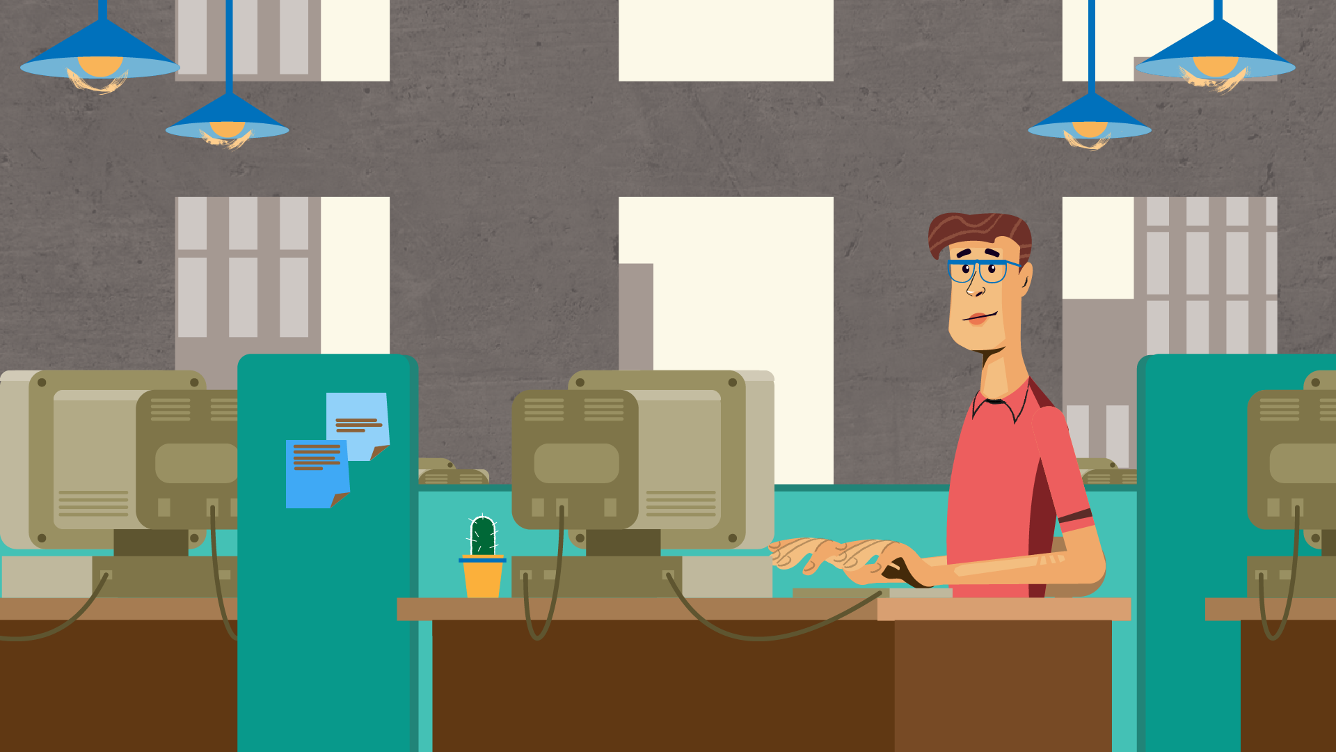
It’s not always easy to find a trustworthy professional, but with this platform, you no longer need to look for the right software developer by yourself. Our main goal was to illustrate cool nerds who are working day and night to put your mind at ease delivering excellent service.

#4
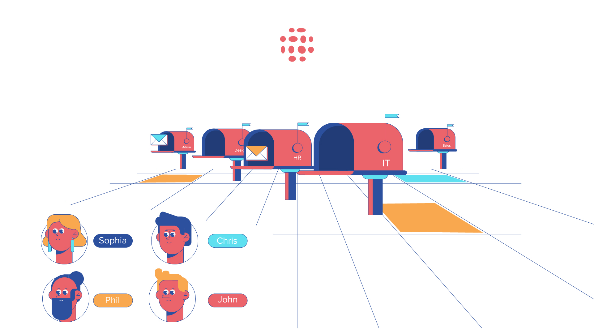
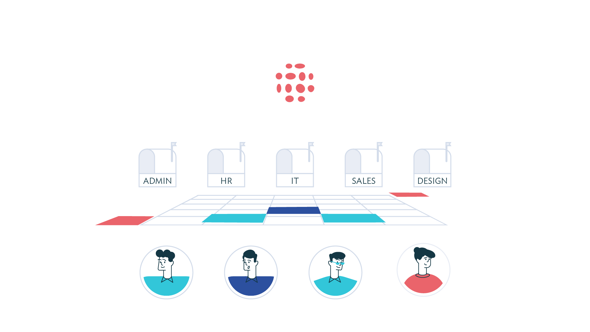
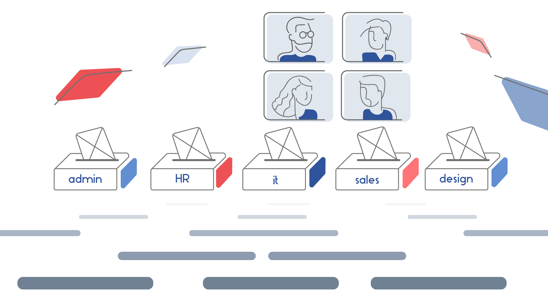
Styleframes for this service we like the most. It was important to show as many details as possible to work with them during the animation process for a better understanding of the service this team provides. In short, this platform gives you everything you need to collaborate with teammates, add knowledge and get things done without the clutter.
#5
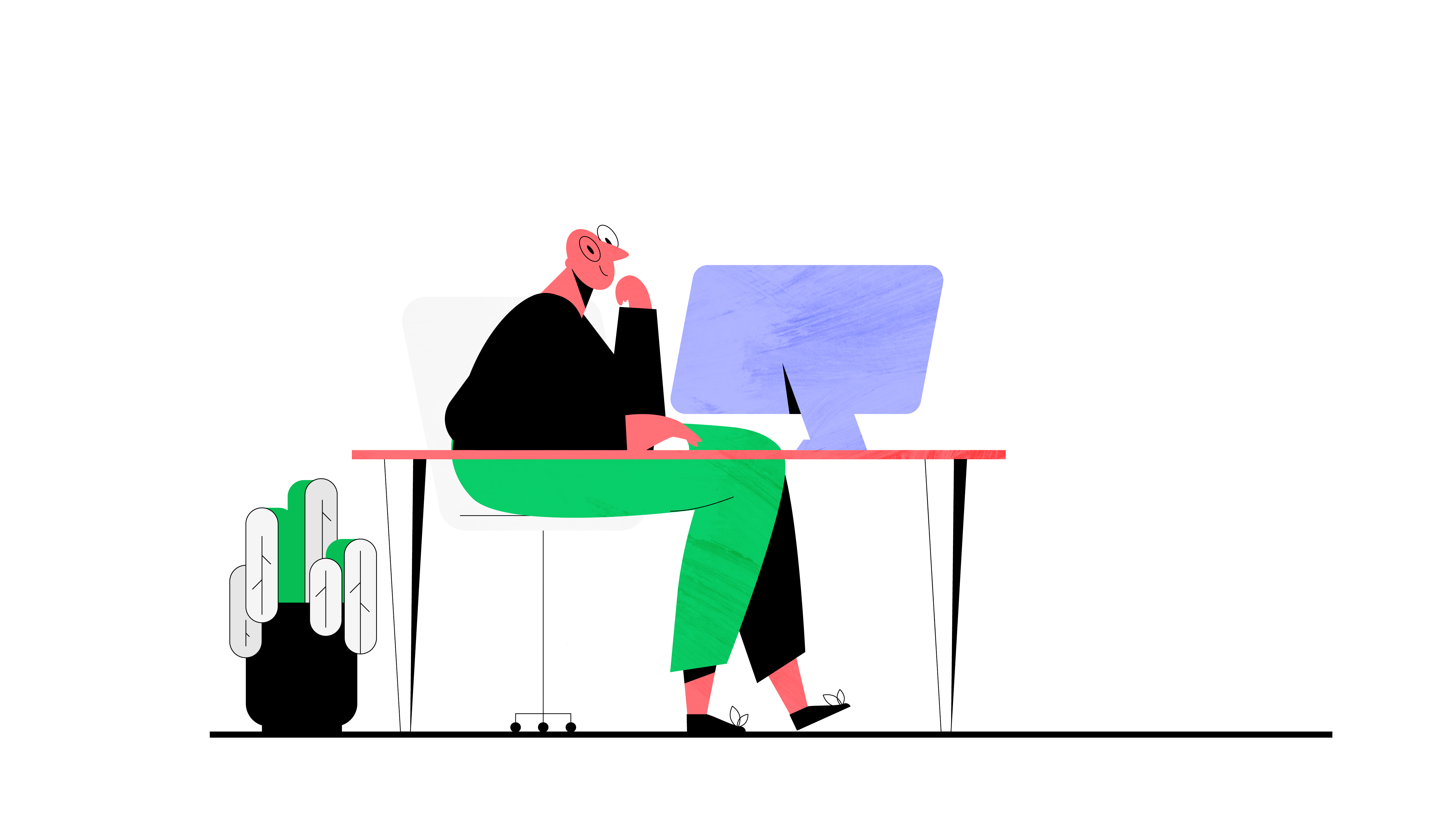
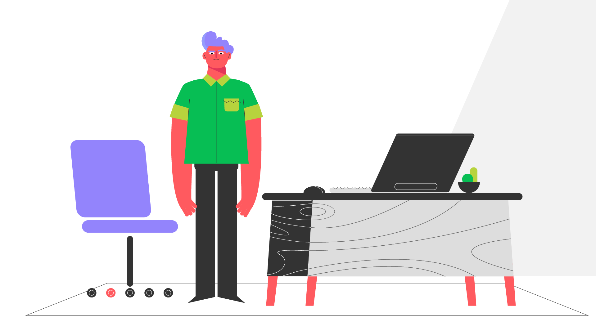
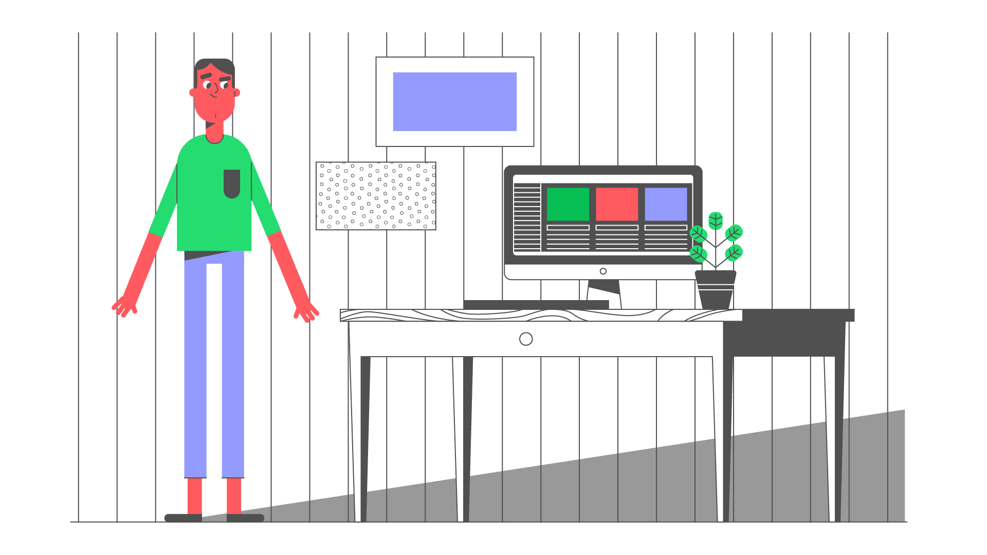
This project is still in progress and the ready-made version is coming, but we could not miss the opportunity to share the styles we created for this service. The people are working engine of any organization and only together workers can reach all goals of the company they’re working in. Working together means have the power to solve any problems and work for the common good. Good motto, isn’t it?
#6
We made these styles for affordable review platform which helps businesses to get more customers. All you need to get started is to add one of its clever widgets to your website and see the benefits of stars in your search results! Do you want to try? But first, check out our styles.
#7
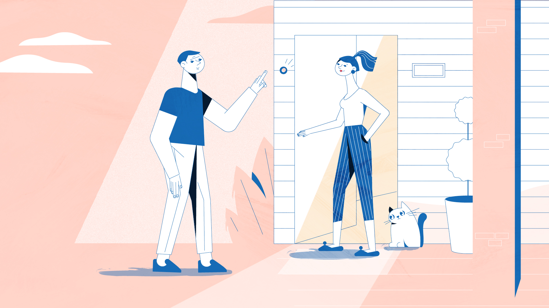
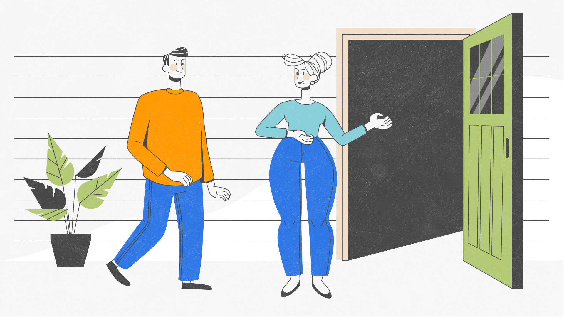
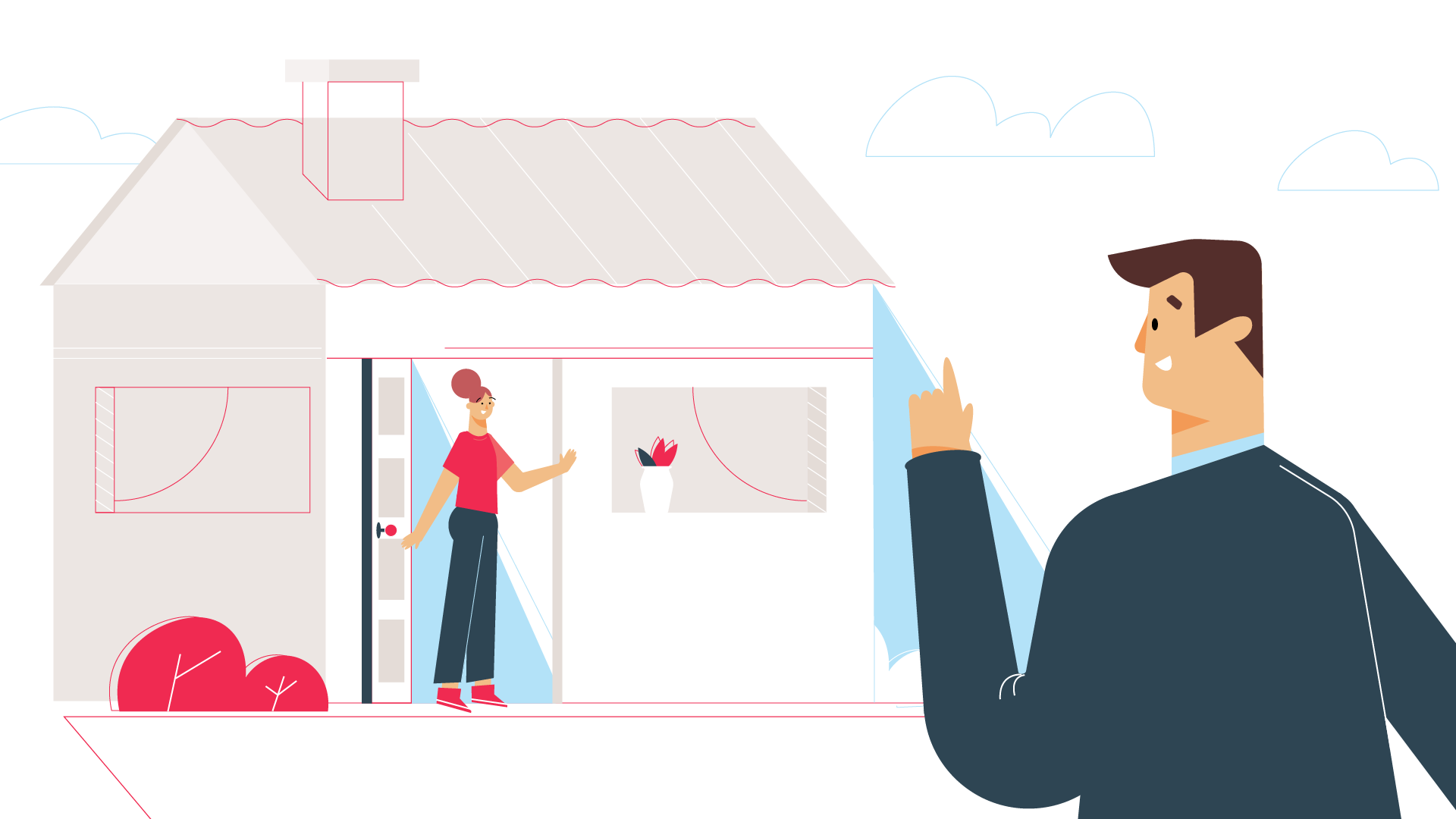
This platform provides top education and the student is the director. You can find study coaches who support you and help to reach your goals. Daily, weekly and monthly students influence their own study route.

#8
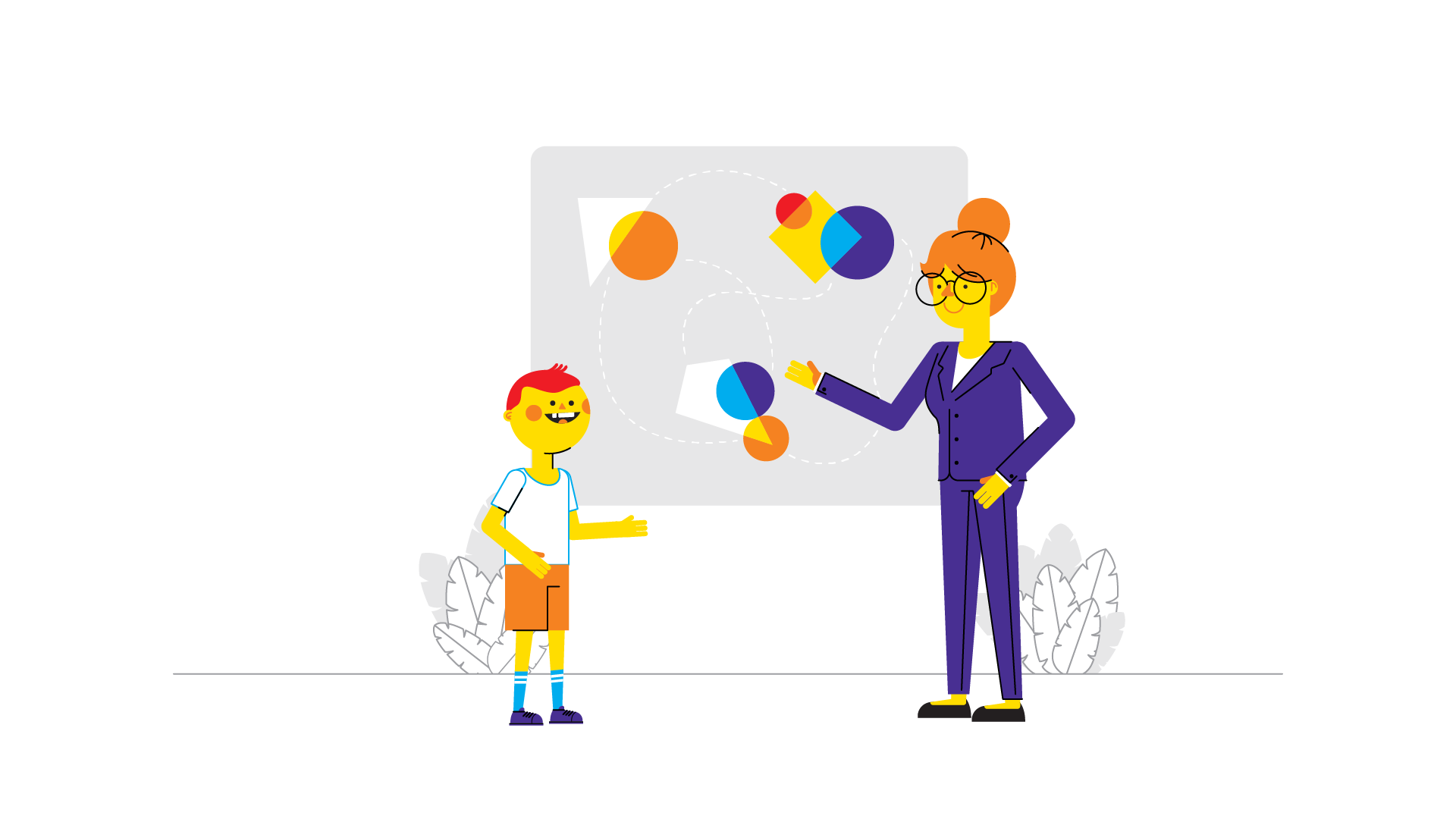
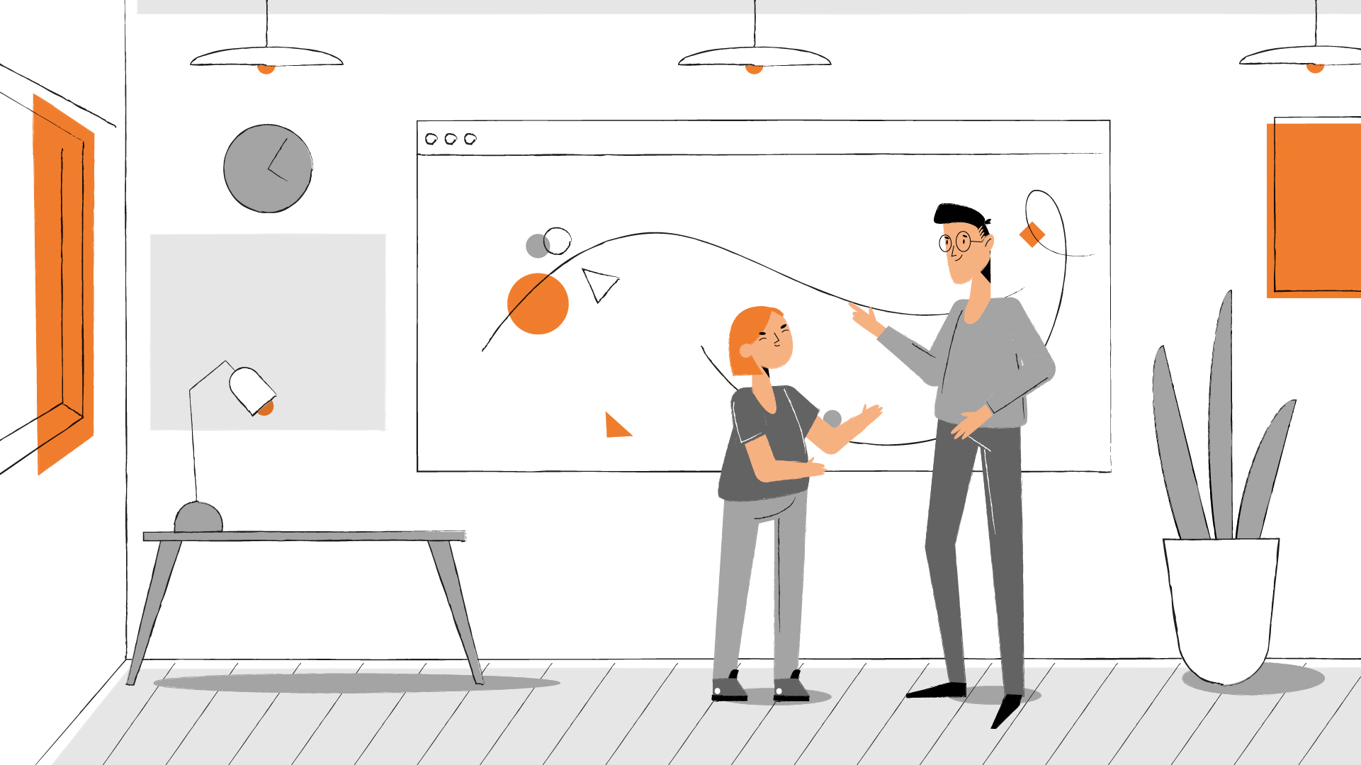
For this project, we started drawing styles based on the reference we received from our client at the beginning of the project. We had to create outstanding styles to catch the attention of the viewers. In our opinion, the style which our client liked the most is something like a mixture of True Detective and Alice in Wonderland. In addition, you can watch a ready-made video heading to the link: lumoa



#9
This service offers a complete service bundled in a simple app. Installation, delivery, monitoring of usage-data and 24/7 breakdown assistance – all the things that are important for you. Do you want to be faster and fitter at your destination? With this app you can.
#10
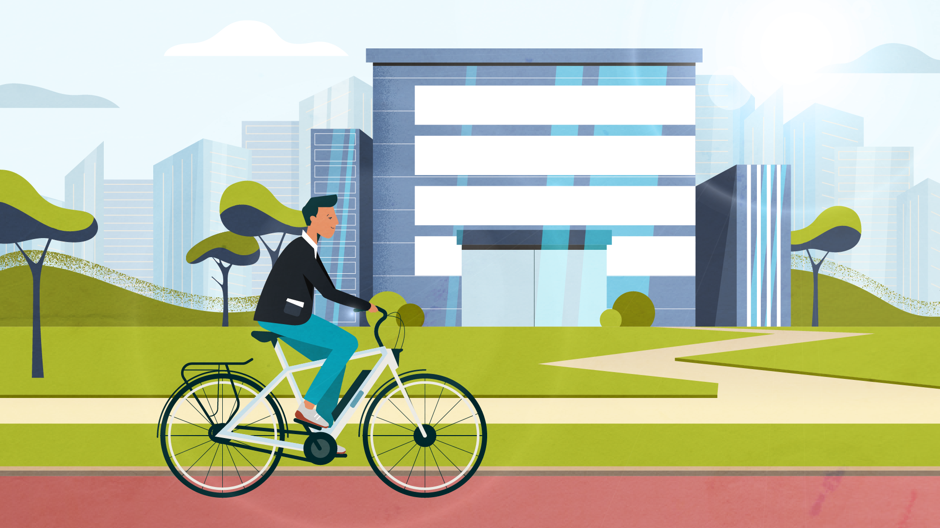
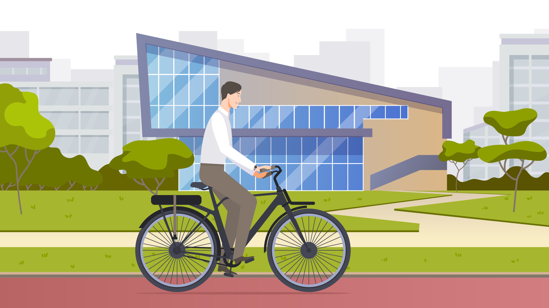
Europe is nearby. From practical matters to special issues, Europa Info Centre answers your questions directly or helps you find the right information through an organization that helps you further. We can’t say that we’re really fond of the style our client chose. But we’re impressed with the final result we got using this style. In addition, you can watch a ready-made video heading to the link: Europa Info Centre



#11
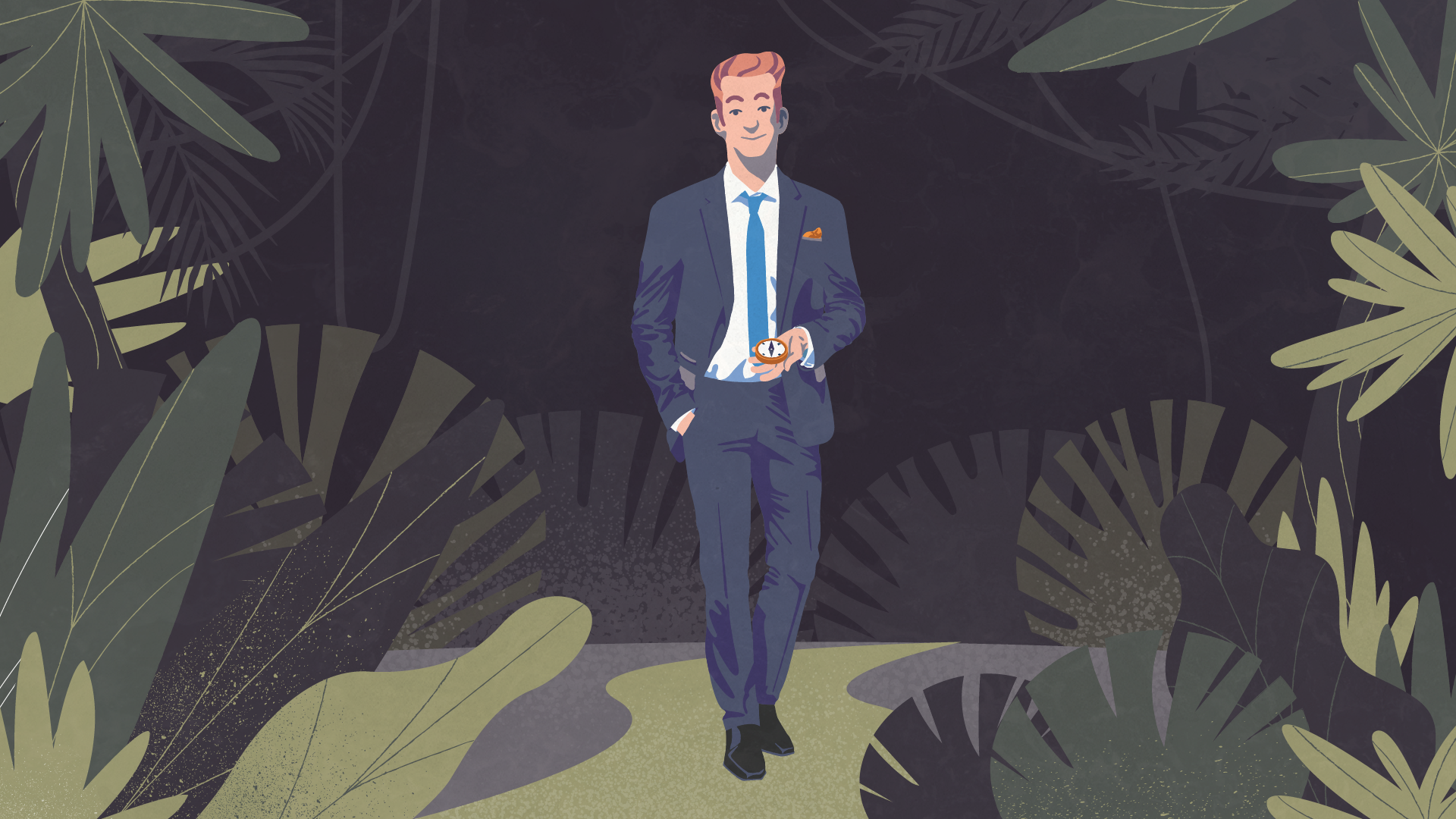
The main task for these styleframes was to show Max, who is an entrepreneur and got lost in the information jungle of the General Data Protection Regulation. In our opinion, we offered cool options and could convey the main idea of this service which protects companies against warnings and high penalties.


#12
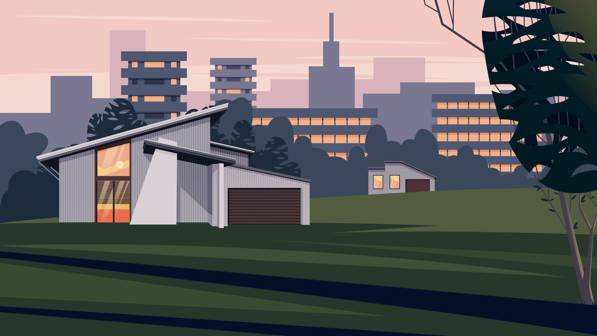
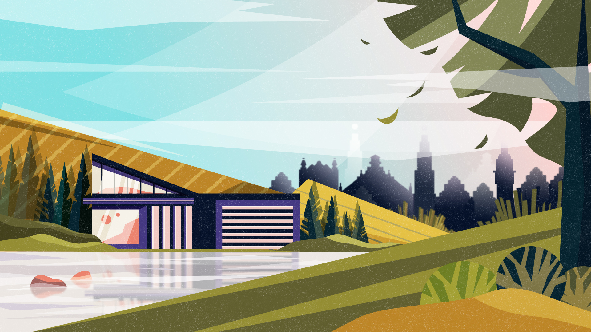
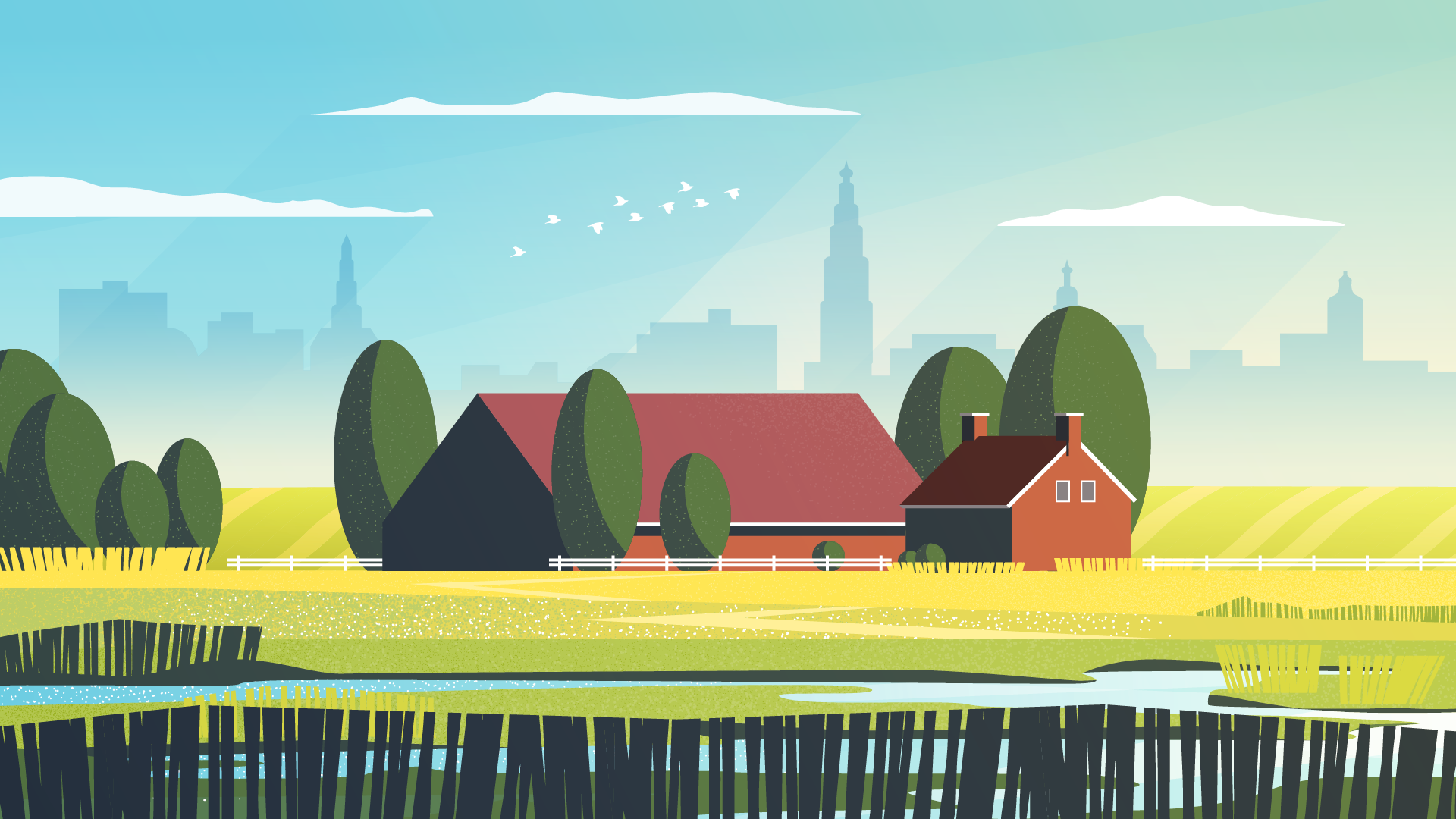
For this project, we got a ready-made script from our client (more often we write it by ourselves to simplify the process for both client and us) that’s why we immediately set to design creation. It had to be simple, but interesting and catchy. We made 3 styleframes to give our client an opportunity to choose the best option. Above all, we had to convey the atmosphere of this amazing, but a shrinking region.
You can watch a ready-made video heading to the link: A shrinking region in the Netherlands
#13
This project is our long-term cooperation because now we’re still working on different versions for it. To help this company to improve their internal processes, we create different explainer video telling how to automates all the user lifecycle management in AD.

If you want to know more about video production, you can also read the following articles: