Vertical-First Animation: Why 9:16 Should Be Considered From Day One
Vertical video is no longer just a format for quick social media clips. From Instagram Reels and TikTok to YouTube Shorts, it has changed how audiences watch content and how brands communicate. Yet many animation projects still begin with a horizontal frame, with vertical versions treated as an afterthought. The plan is often simple: create the animation in 16:9, then crop it to 9:16 once production is complete. Sometimes, that works. But when an animation relies on carefully composed scenes, character interactions, typography, or detailed visual storytelling, adapting it later can compromise the original creative vision.
At Hound Studio, we see format as more than a technical specification. It influences composition, pacing, and storytelling. That’s why considering vertical video from day one can make a real difference to both the production process and the final result.
Let’s look at why a vertical-first approach matters and how to incorporate it into your animation workflow.
What Is Vertical-First Animation?
Vertical-first animation means considering the 9:16 format during the initial creative development rather than introducing it only when the animation is ready for delivery. It doesn’t necessarily mean creating exclusively for vertical screens. Instead, it means making informed decisions about aspect ratios before those decisions become difficult or expensive to change.
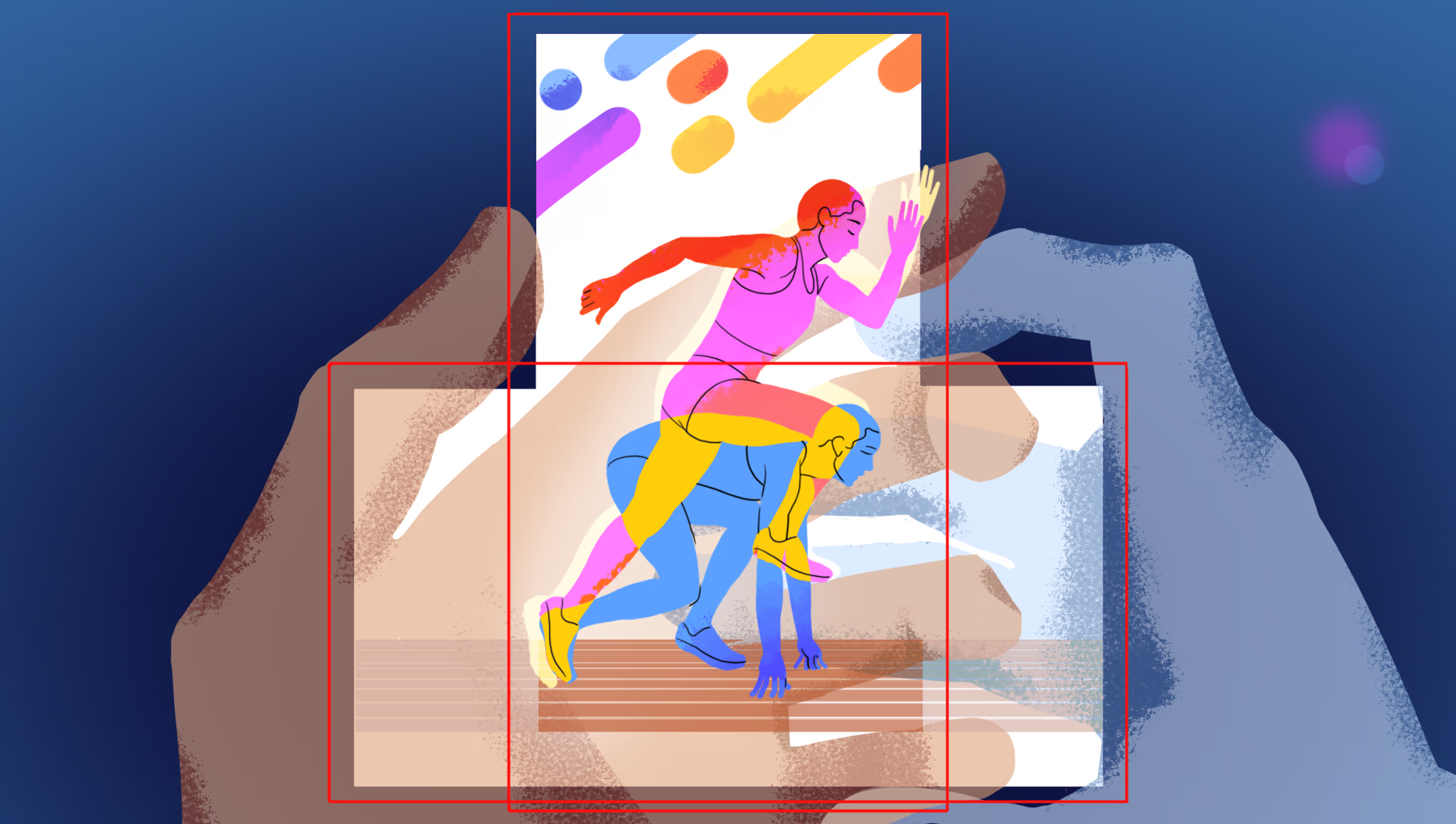
The team considers where the animation will be watched, how much screen space the visuals will occupy, and how the story will unfold within the frame. These considerations influence everything from storyboards and character placement to typography, camera movement, and transitions. For example, a horizontal scene might place two characters on opposite sides of the screen. In a vertical frame, the same arrangement could leave them too small or push one outside the visible area. A vertical-first approach allows the team to rethink the composition, perhaps using different character positions, closer shots, or a sequence of visual reveals.
The goal isn’t simply to make an animation fit another screen. It’s to make sure it works as intended wherever people watch it.
Why Consider 9:16 From Day One?
1. Composition Needs to Work With the Format
A horizontal frame offers plenty of room for multiple characters, environmental details, and supporting graphics. A vertical frame has less horizontal space, so the same elements may compete for attention. Simply cropping a horizontal animation can cut off important details, disrupt the balance of a scene, or weaken the visual relationships that made the original composition effective. Planning for vertical early allows designers to build compositions around the format’s strengths.
This might mean using larger characters, arranging elements to create vertical depth, simplifying busy scenes, or rethinking how characters interact within the frame. It also means considering platform interfaces. Important details, text, and calls to action should remain visible rather than being covered by captions or other on-screen controls.
2. Storytelling and Pacing May Change
An aspect ratio doesn’t just affect what fits on screen. It can influence how a story is told. Horizontal animation can communicate several things at once. The audience might see a character react, another respond, and the environment change within a single composition. In a vertical frame, the same information might work better as a sequence of close-ups, a reveal from top to bottom, or movement that guides the viewer into the next scene. The opening moments also deserve attention. On mobile platforms, viewers may encounter an animation while scrolling, making clear visual hooks and immediately readable actions especially valuable.
That doesn’t mean every vertical animation needs to be faster or more energetic. Slower, atmospheric storytelling can work just as well when the composition holds the viewer’s attention. The key is to make deliberate decisions about how the story unfolds within the format.
3. Typography and Graphics Need More Than a Resize
Text that fits comfortably across a horizontal frame may become too small, wrap awkwardly, or take up too much space in a vertical version. This is particularly important for explainer videos, product animations, educational content, and brand communications that rely on on-screen text. Considering vertical early gives designers room to plan typography, line breaks, transitions, and visual hierarchy around the available space. A long headline might work better across several shorter lines, while a complex diagram could become a sequence of simpler visual steps. The priority is legibility. Text should be easy to read on a phone, remain on screen long enough to process, and avoid competing with the main action.
How Early Planning Improves Production
Considering vertical video from the beginning isn’t just about creative quality. It can also make animation production more predictable and efficient.
Storyboarding and Animatics
The earlier the format requirements are established, the easier it is to plan scenes that work across different aspect ratios. At the storyboard stage, the team can identify compositions that need adjustment, test character interactions, and make sure important visual reveals translate to mobile screens. An animatic then helps evaluate pacing and visual clarity before the team commits to detailed artwork and animation. This is also the right time to decide whether one adaptable composition will work or whether separate versions are needed.
Illustration and Animation
Different animation techniques bring different considerations. In 2D animation, character positions, backgrounds, and visual elements can often be planned to accommodate multiple formats. Frame-by-frame animation may require additional drawings when compositions or movements change. In 3D animation, changing the camera angle can reveal areas that were never designed to be seen, requiring adjustments to staging, lighting, or object placement. Planning ahead helps teams anticipate this work instead of discovering problems after production is complete.
Budget and Timeline
Adapting animation to additional formats can affect both budget and delivery schedules. The impact depends on the animation style, complexity, and amount of redesign required. If vertical video is included in the initial scope, the team can estimate the additional work more accurately. If it’s introduced after the animation has been approved, the project may require new compositions, revised timing, or additional animation. Not every adaptation requires a complete reanimation. The important thing is to distinguish straightforward reframing from creative changes that need additional time and resources. Planning for multiple formats from day one doesn’t eliminate every production challenge. It makes those challenges easier to anticipate and manage.
One Animation for Every Format or Separate Versions?
The right approach depends on the content, platforms, budget, and creative goals. There are three common options.
1. One Master Animation
The animation is designed with flexible compositions that accommodate different aspect ratios. Important elements remain visible, and only minor adjustments may be needed. Best for: Simple product demonstrations, brand animations, and content with a clear central subject. The trade-off: Compositions may need to be more restrained to work across formats.
2. One Animation With Format-Specific Adjustments
The team creates a master animation and adapts it for each required format. Changes might include reframing, camera adjustments, text placement, or revised layouts. Best for: Campaigns that need consistent branding across multiple channels while allowing some creative flexibility. The trade-off: Complex compositions and character interactions may require additional production work.
3. Separate Versions for Different Formats
Horizontal and vertical versions share the same concept and visual identity but use different compositions, pacing, transitions, or scene arrangements. For example, a horizontal version might establish a product within a wider environment, while the vertical version uses close-ups to highlight its features. Best for: High-priority campaigns where each format needs to deliver a strong creative result. The trade-off: This approach requires more planning and production resources. The decision should be based on the creative requirements, not the assumption that one approach is always more efficient than another.
Common Mistakes to Avoid
Even when teams recognize the importance of vertical video, a few common mistakes can undermine the result. Treating cropping as a complete solution. Cropping won’t automatically preserve the composition, storytelling, or character interactions of the original animation. Discussing aspect ratios too late. Introducing vertical requirements after production can lead to unnecessary revisions and additional costs. Putting everything in the center. A narrow central composition may make resizing easier, but it can also limit creative possibilities. Flexibility should support the idea, not dictate every decision. Ignoring mobile legibility. Small text and intricate details that work on a large screen may become difficult to read on a phone. Always test the animation at its intended viewing size. Assuming every format needs identical timing. Some scenes may benefit from different pacing or a more focused sequence in vertical. Preserving the message matters more than reproducing every frame exactly.
Final Thoughts
Vertical video has changed how audiences encounter animation, but the fundamentals of good animation remain the same: clear storytelling, thoughtful composition, purposeful movement, and an understanding of what the audience needs to see. What has changed is the importance of considering the viewing format early enough to make those fundamentals work across different screens. When 9:16 is included in the creative brief from day one, teams can make smarter decisions about storyboards, illustration, animation, and delivery. The result is less reliance on last-minute fixes and more opportunity to create content that feels intentional in every format.
At Hound Studio, we believe great animation starts with the right creative decisions, long before the final frames are rendered. And when vertical video is part of the plan, those decisions should account for the vertical frame from the very beginning. Because adapting animation to a screen is one thing. Designing it to work on that screen is another.