This animation was born not from a client’s request, but from a deep emotional need. As a Ukrainian animation studio, we live the war not as distant news, but as a daily reality that shapes our lives. We could not stay silent.
What started as an internal idea quickly became something greater – a form of artistic resistance. We wanted to create a voice through visuals, to capture emotions that words alone cannot carry. This project became our quiet roar: not about weapons or battles, but about resilience, hope, and freedom.
The Challenge: Telling the Truth Without Violence
From the very beginning, we knew we would not show tanks, soldiers, or direct violence. Yet, the truth of war demanded to be told. Our challenge was clear: How do we express destruction, chaos, and fear, while still keeping hope alive? The answer was not realism, but metaphor. We needed a symbolic language that could express pain and courage, despair and resilience – all at once.
The Creative Process
From Idea to Story
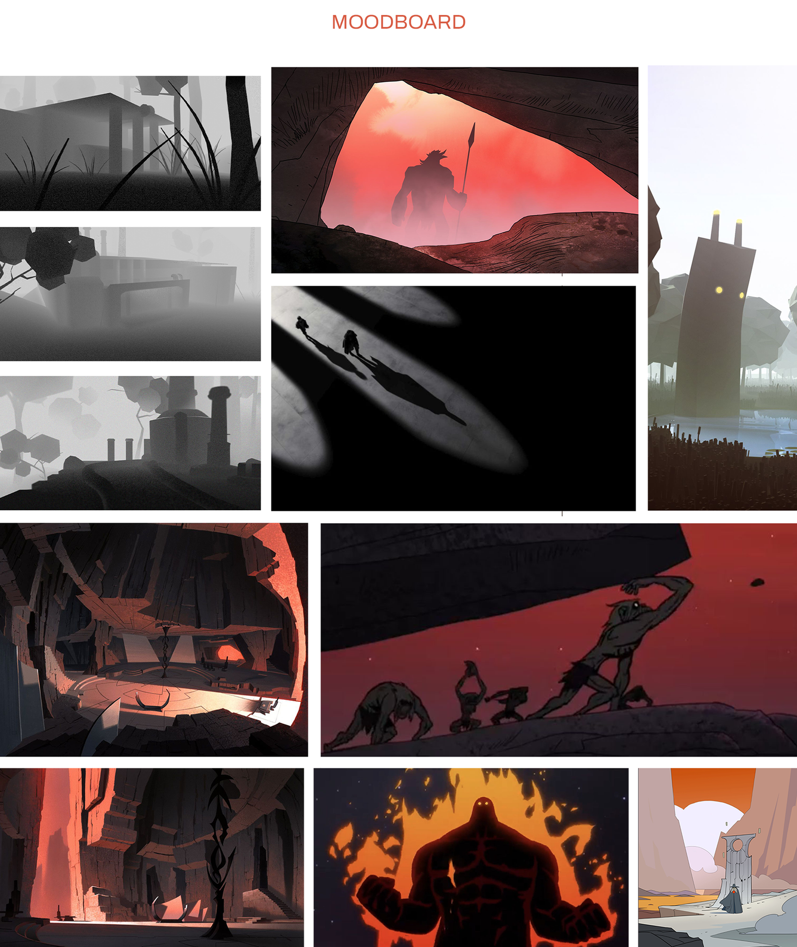
The process began with raw emotions translated into concepts. We gathered thoughts, images, and feelings and shaped them into a poetic storyline. Instead of focusing on literal events, we defined abstract moments: the rise of chaos, the push of darkness, and the return of light.

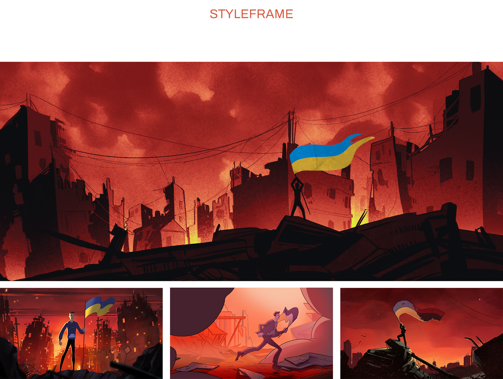
Styleframes
Once the narrative took form, we began building styleframes. These early key visuals served as snapshots of the final look, helping us lock the tone, color palette, and mood. Every frame was a canvas for symbolism – blue and gold reflected pride and resilience, red and orange conveyed chaos and courage, while grey revealed the weight of oppression. Styleframes gave us a clear emotional compass before the animation even began.

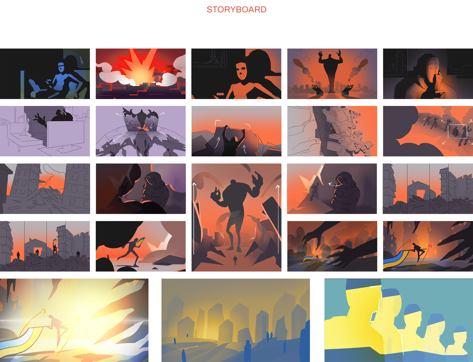
Storyboarding
With the mood and visuals defined, we moved into storyboarding. This stage was about rhythm and intention. Shot by shot, we mapped out the emotional flow – from oppression to resistance, from darkness to light. Each panel wasn’t just a sketch; it was a heartbeat of the story, ensuring that the transitions felt natural, the pacing held meaning, and every scene carried weight before being brought to life through animation.

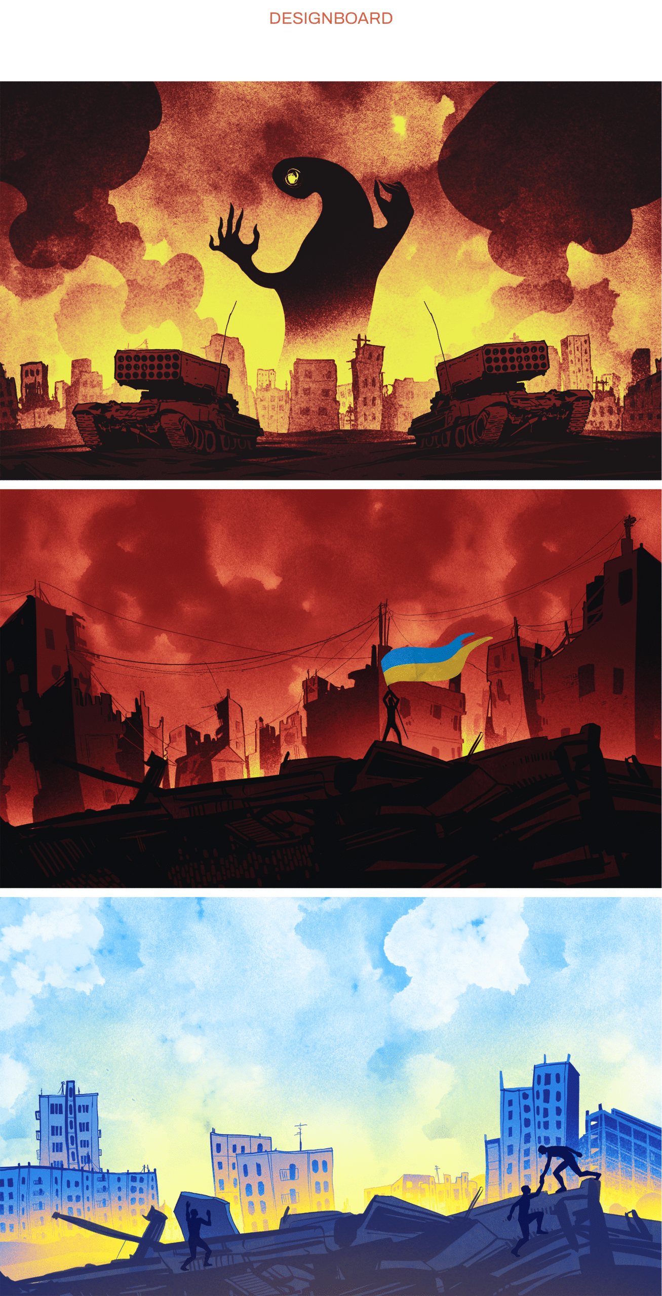
Designboard
Designboards came next – refining shapes, symbols, and color treatments. Every visual element was chosen carefully:
- Deep blue and gold – a nod to the Ukrainian flag, the sky above and wheat fields below, pride and pain.
- Reds, oranges, yellows – explosions of chaos and destruction, but also the fire of courage and resistance.
- Greys and shadows – oppression and evil, always chased by light.

Animation: 2D & Frame-by-Frame
The Solution: Speaking Through Symbols
The Result: A Tribute to Resilience
The final animation became more than an internal project – it became our statement. Released on Ukraine’s Independence Day, the film carries symbolic weight: it is a tribute to freedom, unity, and the resilience of a nation that continues to fight.
For us, it is personal. For the world, we hope it is a reminder: the fight is not over, but neither is the light.
Beyond the Screen
At the end of the animation, we placed a QR code leading to Come Back Alive – turning art into action. Because there is no such thing as a small donation. Every contribution matters. Every coin can save lives.
This project is our way of resisting with what we have: creativity, vision, and heart. And we will continue to create, to resist, and to shine – because art, too, can be a weapon of hope. Check the full animation and creative process here!